Out Of Options – On-Demand Mobile App UX/UI Case Study

Out Of Options is an on-demand mobile app which allows users get quick help regarding small jobs at home. The app also allows users to find local deals in their neighborhood.
Client
Based in Sweden, our client Jonas Augustsson approached us with the idea of a location-based on-demand app that connected people who needed to get work done with the service providers.
The main idea behind developing this app was to make the life of people juggling between tasks a little less stressful. The focus was to make the process of getting quick help for household jobs like carpentry, gardening, etc. easier so that the customers could be more productive with their time as they wouldn’t have to worry about such tasks on their own.
Special requirements for the app included:
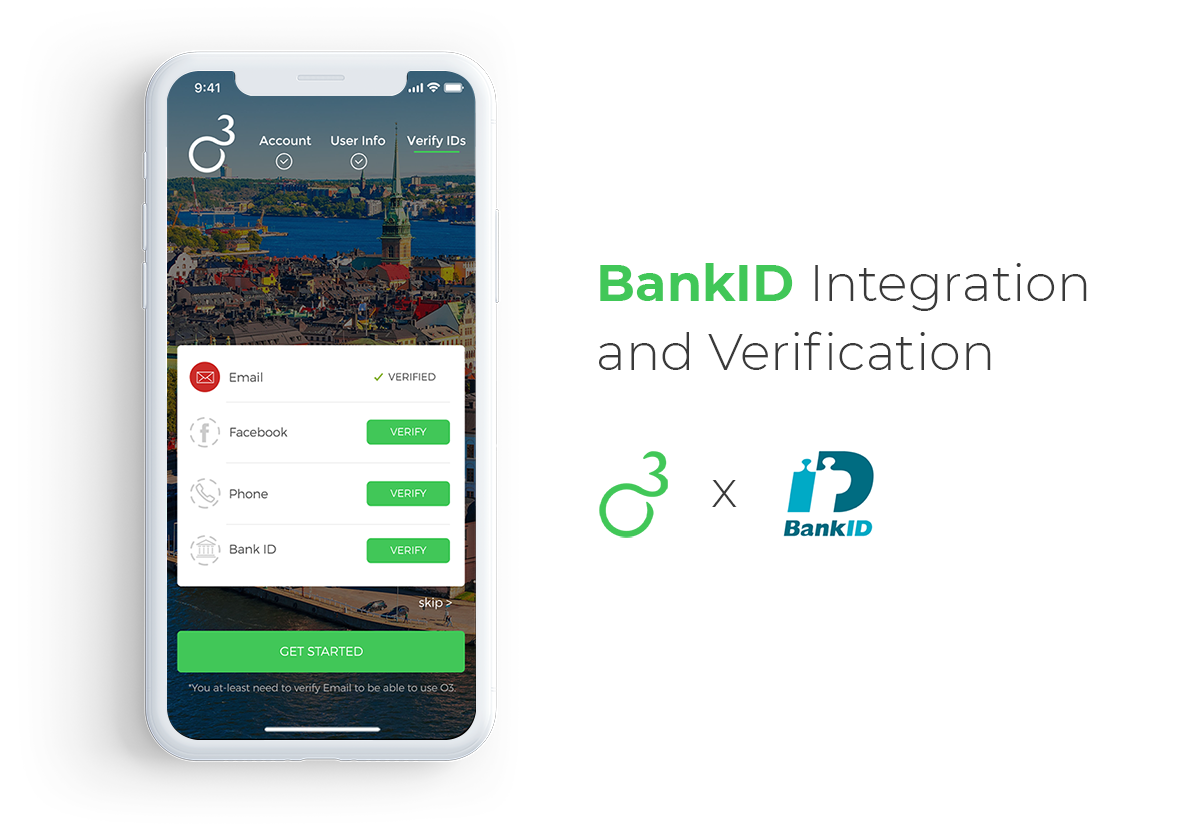
User verification with Bank ID, an electronic identification solution in Sweden.
Private messaging functionality for communication between job posters and helpers.
To describe what the app should look like, the client shared some rough mockups with our team.
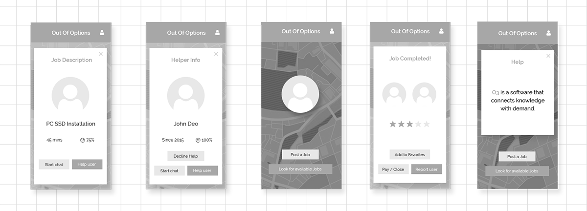
Challenges
Creating a design that works seamlessly for both buyers and sellers at the same time.
Choosing the right payment gateway for our particular situation.
Bank ID integration which also meant we were required to help the client with publishing the app on Apple’s App Store.
Keeping the app UI simple and visually pleasing while staying feature-rich.
Research and Analysis
In Sweden, for a substantial portion of crowd workers, working for online gigs is their only source of income. According to research and survey conducted by the University of Hertfordshire and Ipsos MORI among 2146 online adults aged 16 – 65 across Sweden, 62% said they were looking for offline household work like carpentry, cleaning, etc. via online platforms. Most people said they were looking for several different types of work even outside their occupational roles.
We decided to focus on key areas like functionality as well as on making an effective design that’s convenient from a user’s perspective. Splitting the functionality into two separate apps for buyers and sellers didn’t seem feasible as we discovered that the same set of users was likely going to use either app.
To obtain a better picture of how the on-demand app should look like, we analyzed some non-local competitors which gave us an idea about what the competitors were doing and what kind of opportunities the app had.
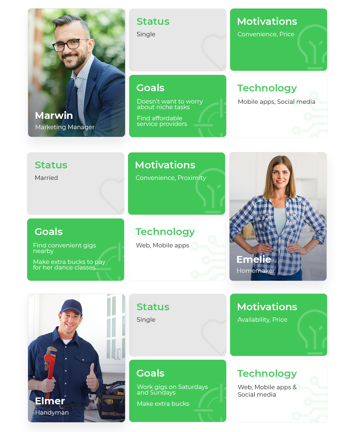
User Personas
Design Process
Mockups
Based on our client’s requirements and our findings, we created the following mockups.
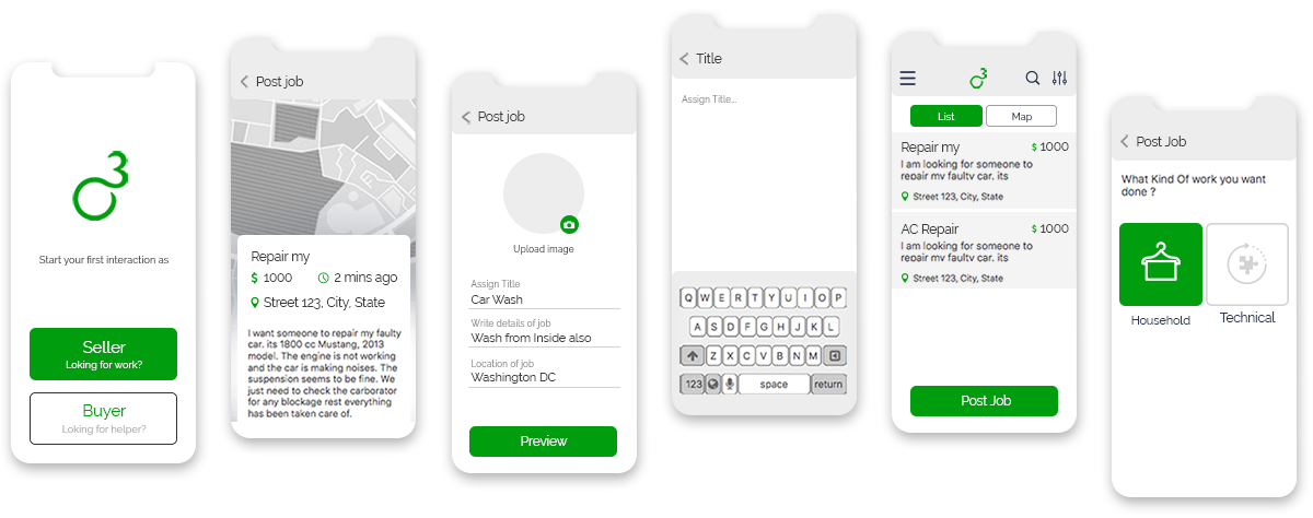
User Flow
We made a comprehensive map that shows the user flow of the key processes depicting the journey of both types of users – Buyers and Sellers.
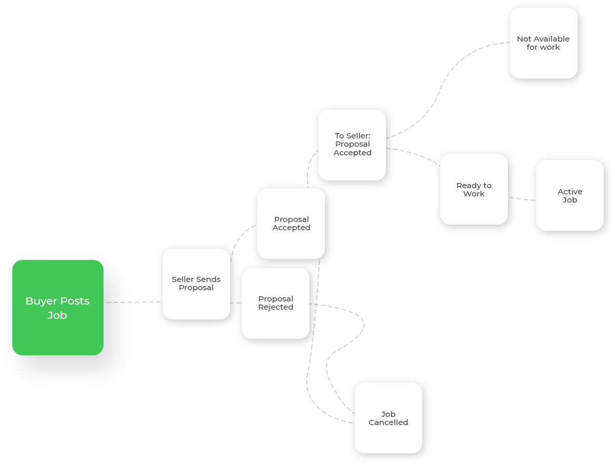
Logo Design
Keeping the functionality of the app in mind, we wanted to design a logo that was easy on the eyes and that evoked a sense of assurance.
Considering all the aspects, we experimented with geometric shapes and tried to merge the sensibilities from the spiral and circular shapes.


After creating different iterations of the logo, this design was finalized.
There are 3 O’s in the business name, Out Of Options. The logo is a play on letter O and number 3, which has the advantage of giving the business an immediate recognition.
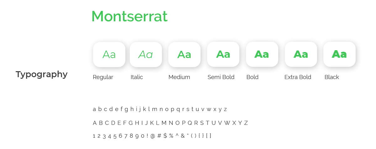
Style Guide

Creating a Solution
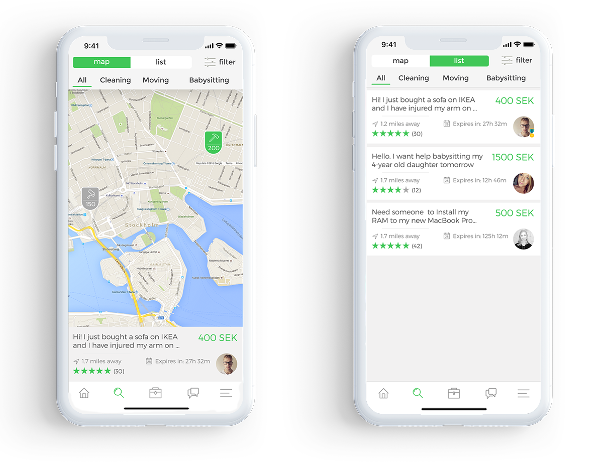
Find Jobs Near You
Use map view or list view to search for jobs. Additional information about the job like distance and deadline is shown in the list view.
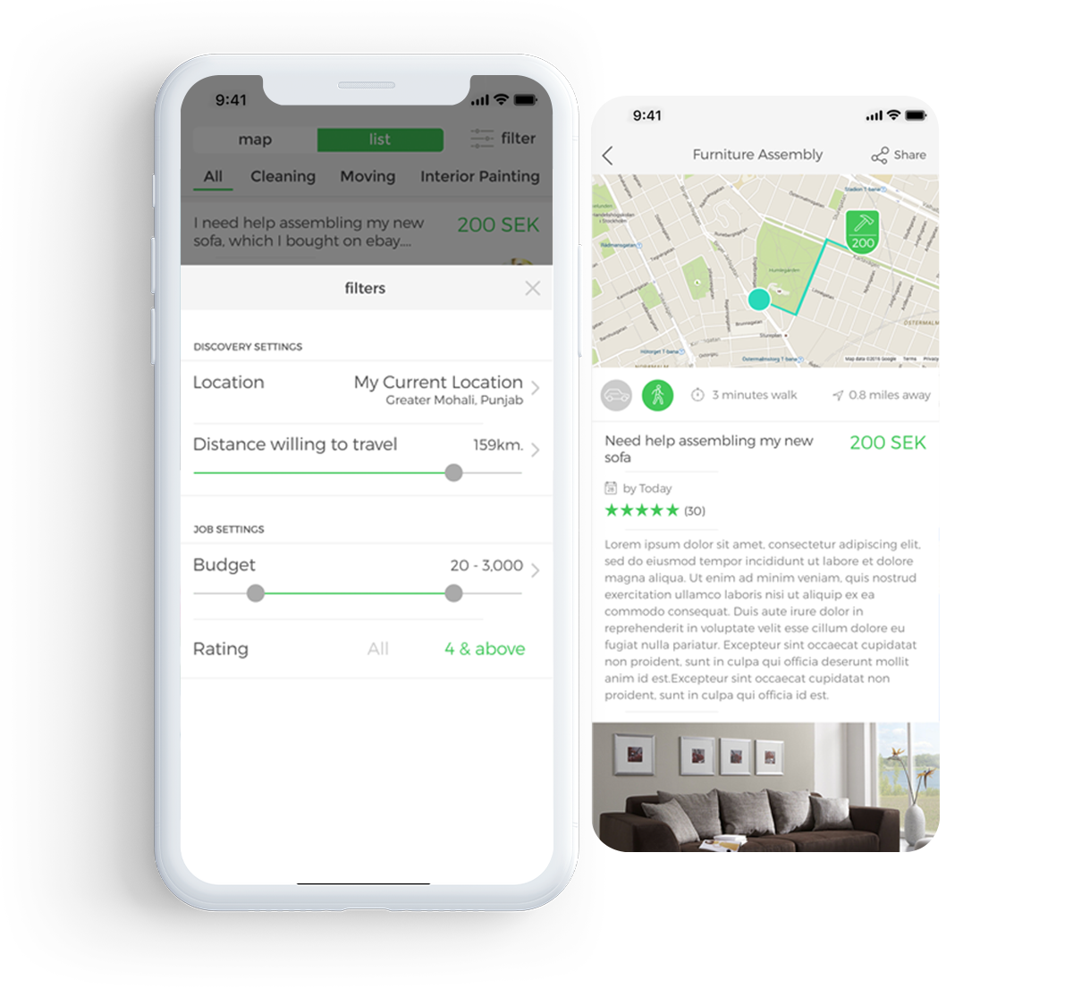
Filter and Track Jobs
To make it easier for the service providers to look for jobs they are interested in, we created a filter that allowed them to browse jobs by Category, Distance or Price. The customer is able to track the helper with the built-in map.
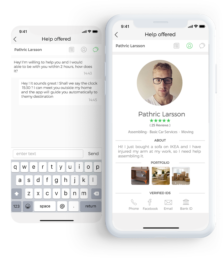
Helper Profile and Messaging
Profile for helpers where they can list their skills and share their portfolio. The list of verified IDs like Phone, Email, Facebook and BankID is shown. The ratings and reviews of their previous jobs are also visible to customers.
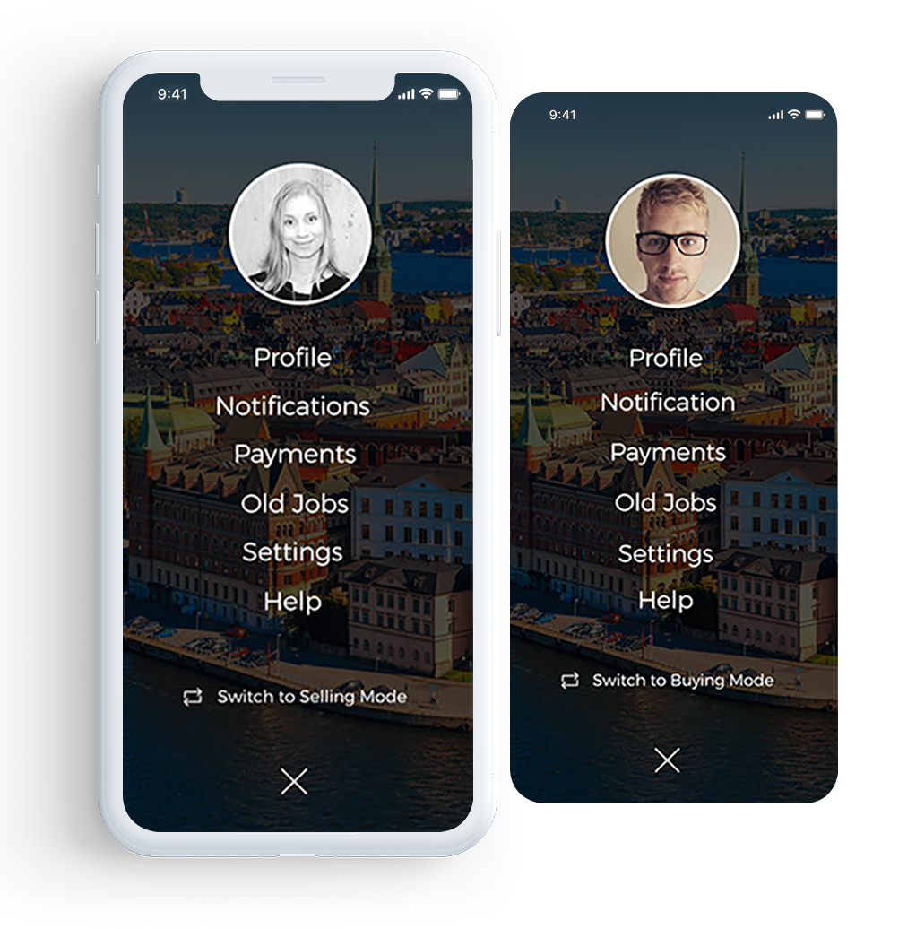
Seamlessly Switch Between Buyer and Seller Mode
We wanted the transition between the Buyer and Seller modes to be as seamless as possible. Users need to simply tap on their profile icons and choose to switch between Selling Mode or Buying Mode. The app functionality switches accordingly.
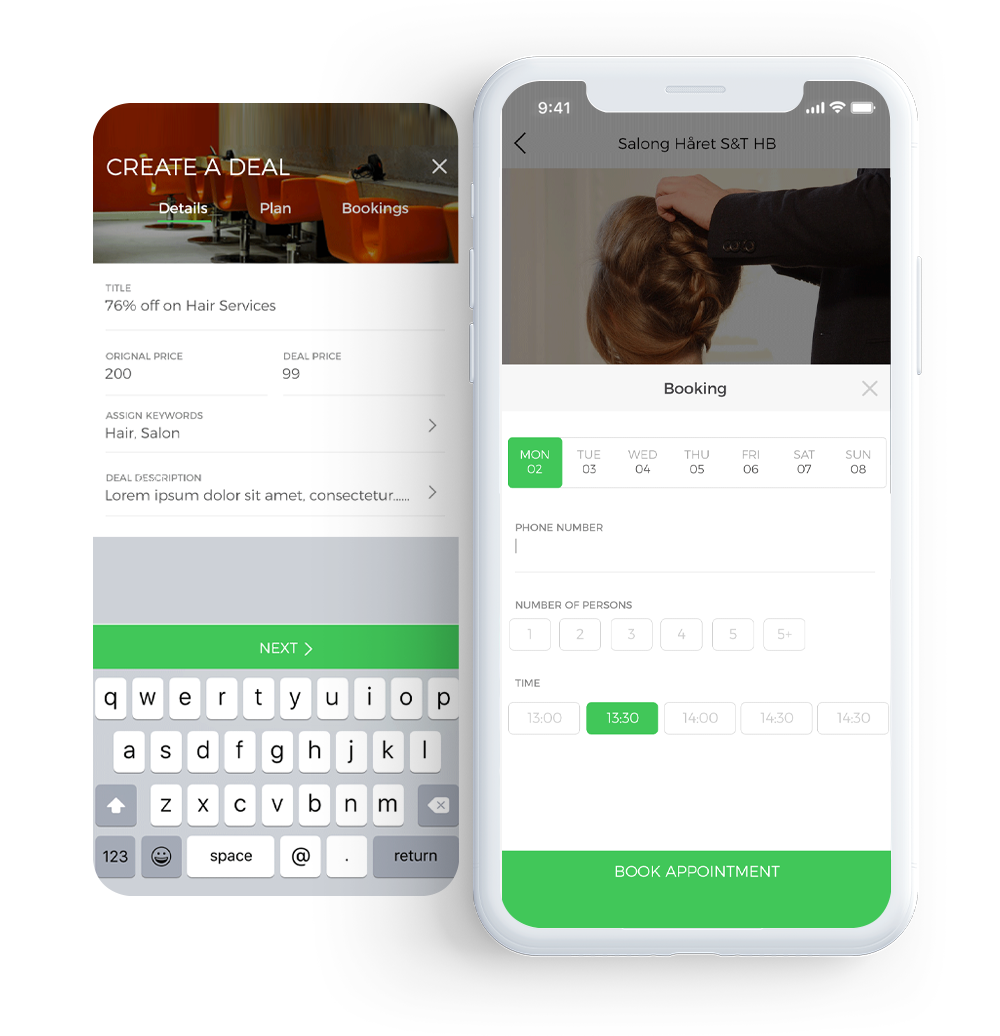
Create Deals and Book Appointments
To help increase the traffic on the app, we baked Deals and Discounts feature right into the app. Our team felt that an online Appointment Booking feature would make a great addition. It’s always a good idea to let customers book anytime as they see fit.
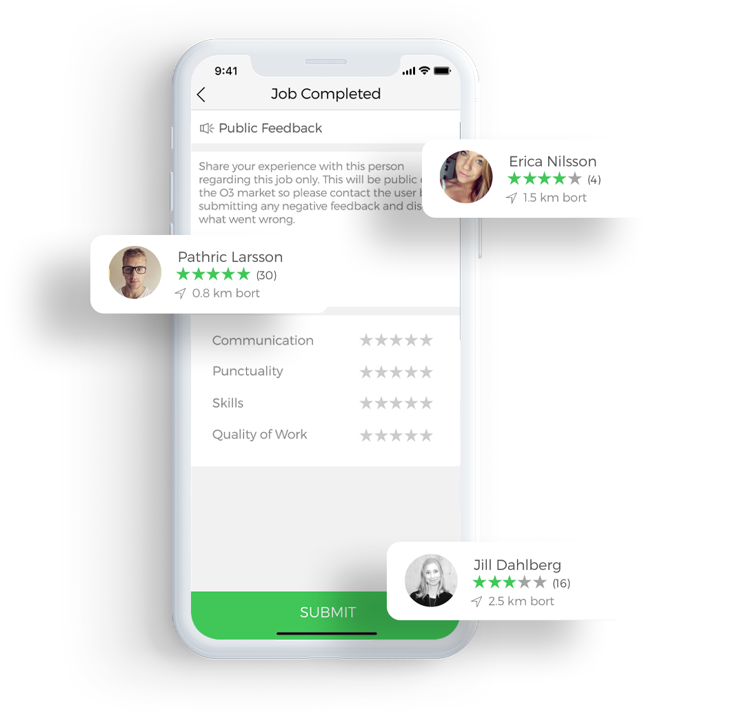
Feedback and Reviews
We made it easier for the customers to leave feedback and reviews for their jobs. A feedback screen pops up as soon as a job is marked as Completed.
Choosing the right Payment Gateway
To decide which payment gateway was right for the app, we compared two of the popular payment gateways.
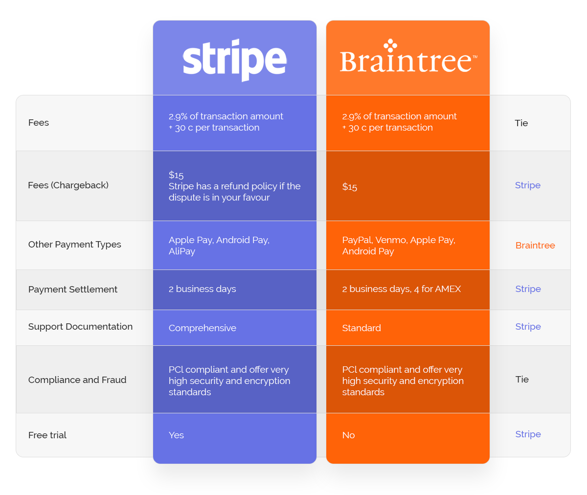
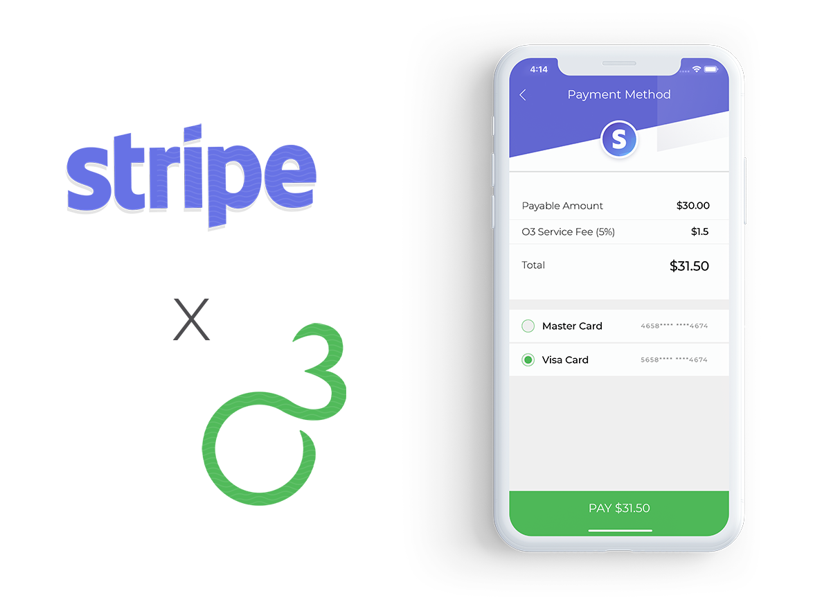
Stripe had exactly what we were looking for and it was the better solution in the long run.
Other Integrations
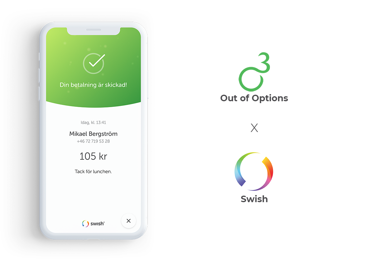
To make the mobile app and on-demand service experience safer and user-friendly we choose the following integrations.

There’s more...
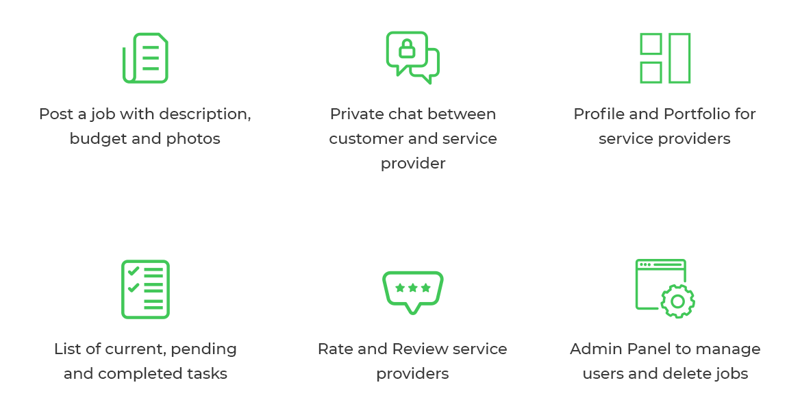
Conclusion
Working on the Out Of Options (O3) app from the ground up was a great journey and we had a wonderful experience with this project. We worked with the client throughout the app development process which included researching, wireframing, design and development to bring his app idea to life. We also had the opportunity to meet a group of 20 users during the app launch at Nyköpings Bomässa 2018 and made sure we addressed their problems.
This project served as a means to boost the on-demand gig economy trend in Sweden by connecting job posters with service providers.