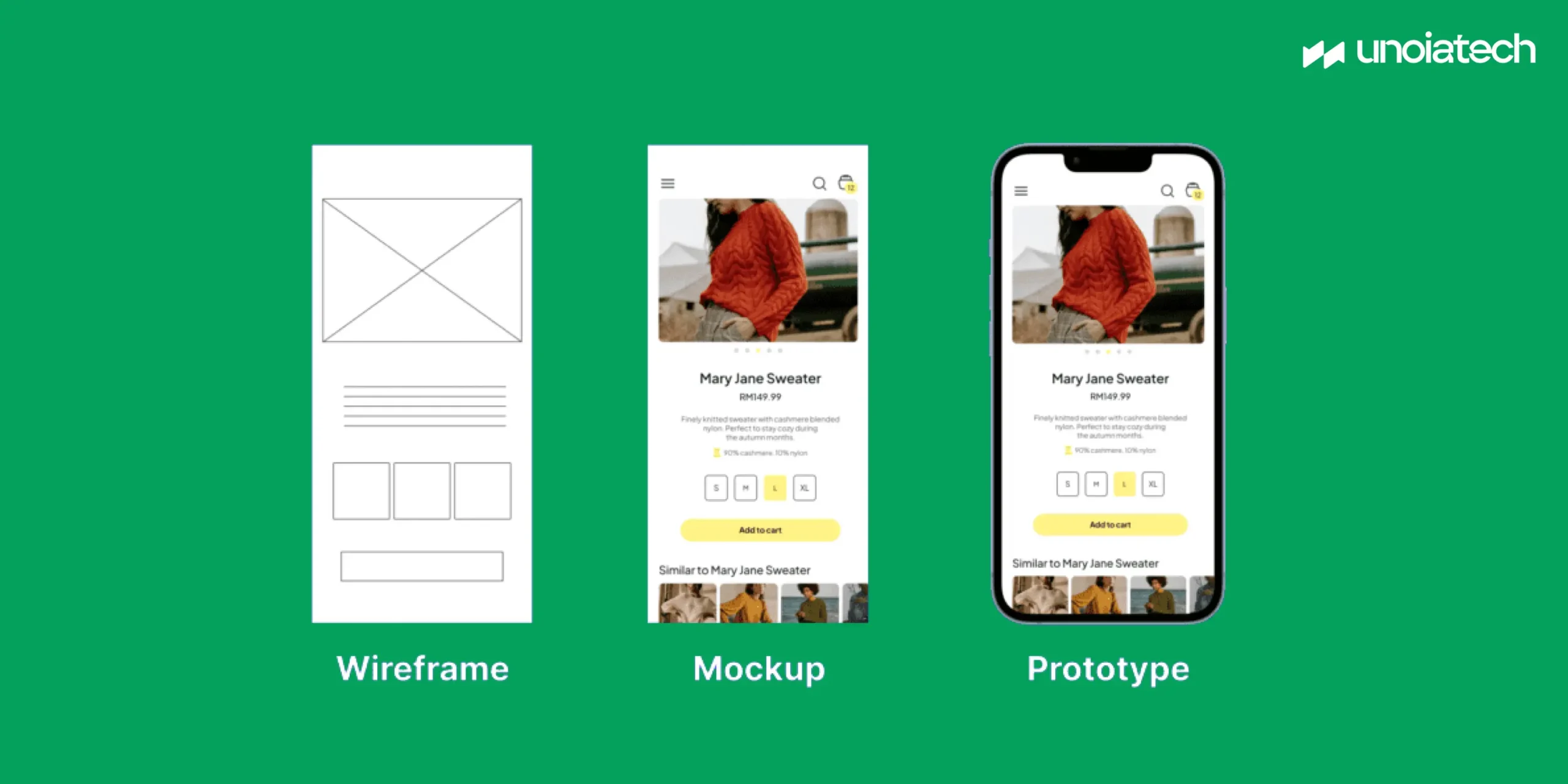
Sketch, Wireframe, Mockup, and Prototype are common terms that you may have come across in the UX/UI design field. These are all simple drawing layouts with varying degrees of fidelity which are used to visualize a website or an app. These drawings are devoid of any real design elements and focus entirely on the structure of the website or app. Most people often confuse these terms but each one of these has a distinctive significance in the design process. Most designers acknowledge only the sketches drawn by hand and black and white wireframes and use colors and design elements only in the later stages. Mockups and prototypes serve as foundations on which developers program the actual app.
Why Should You Do All This?
A picture is worth a thousand words, which is why sketching makes a lot of sense in the first place. Sketch, wireframe will help you figure out what you want to build. You will be able to share the concept with friends, co-founders, and even investors, and apply on-going changes before handing your idea over to a software development company. This will save you both time and money.
Let’s understand the app design process and what each one of these terms mean in the UX/UI field.
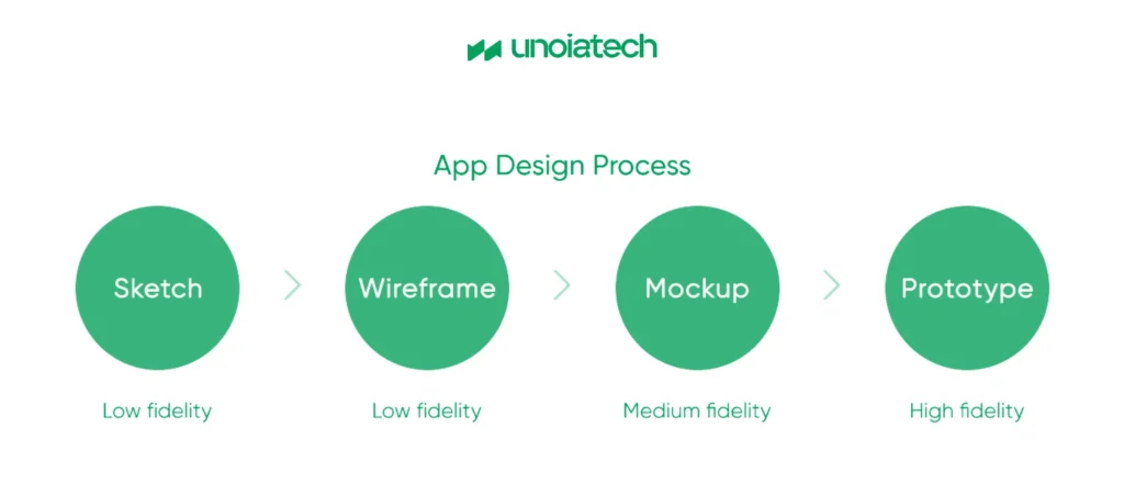
What is a Sketch?
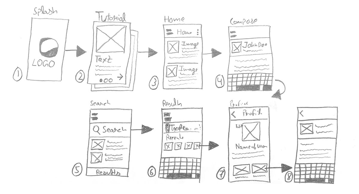
It’s a free-hand sketch made with a pen or pencil on a piece of paper. Sketching often occurs during brainstorming sessions. The goal here is to illustrate your idea and convey it quickly to everyone else. You can easily change details as you’re drawing. This step helps you get to the next stage, i.e. wireframing.
Focus: Concept
Time Invested: < 1 week
Tools: Pen or Pencil, Paper
What is a Wireframe?
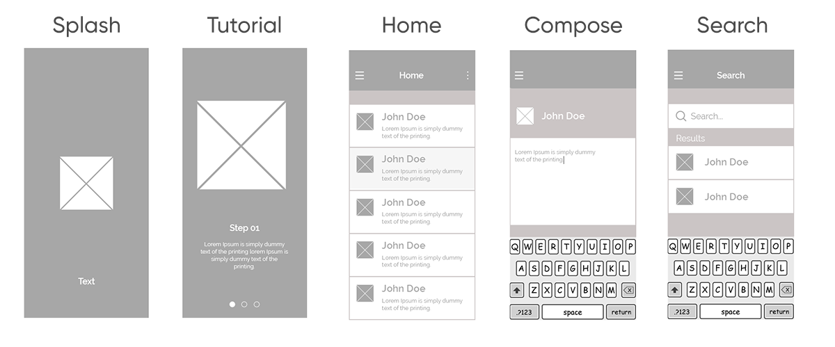
This is the step when your sketch gets an actual structure in digital form. A wireframe is basically a skeleton of your future app. It can be compared to a blueprint of a building in which you have the architecture displayed visually in the form of lines and boxes. The layout of the different elements like images, text and buttons in the app is planned at this stage You can have dummy images and text (lorem ipsum) in a wireframe.
Focus: Focus on what the app will do (Structure + Functions + Content)
Design Fidelity: Low
Time Invested: Up to a week
Tools: Draw.io, Pencil
What is a Mockup?
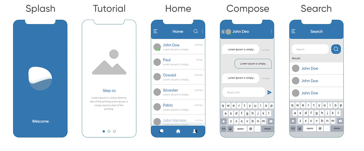
A mockup is a meaningful version of the wireframe. At this stage, images are chosen and colors start to appear in the structure. A mockup reflects the style and mood of the project. You can start taking into account user personas and user behavior. You will have a static map of the app ready at this stage. This will help you organize the app screens and see how the future design will pan out. Mockups provide a medium-fidelity representation and you can share them with the development team to explain the functionality of the app.
Focus: Focus on what the app will look like (Structure + Colors + Right Content)
Design Fidelity: Medium
Time Invested: 1+ weeks
Tools: Sketch, Adobe XD
What is a Prototype?
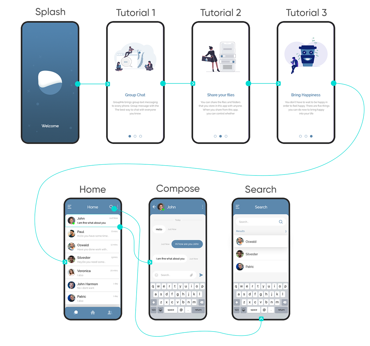
A prototype is a high-fidelity design with clickable elements that simulate the feeling of using an actual app. Even though the interface and the backend are not tied together yet, prototypes can be used for testing usability. Once your prototype is approved, the project can move into the development stage.
Focus: Focus on how a user will interact with the app
(Structure + Colors + Right Content + Interactive)
Design Fidelity: High
Time Invested: Several weeks or months
Tools: Adobe XD, UXPin
Final Word
Every step of the design process has got its own advantages. Sketching is required so that you can explain your idea quickly. Wireframe, Mockup, Prototype bring additional clarity to what is it that you want to create and what your customer needs. Sometimes, you can skip right to wireframing or mockups depending on your project needs.


