What Does A Great Landing Page Look Like in 2022?

What is a Landing Page?
Landing page is one of the pages of a website that is built for conversion of visitors into leads, and eventually customers. Visitors are directed to a landing page after clicking on any marketing email or an online ad. It’s the destination page where the visitor’s information is captured.
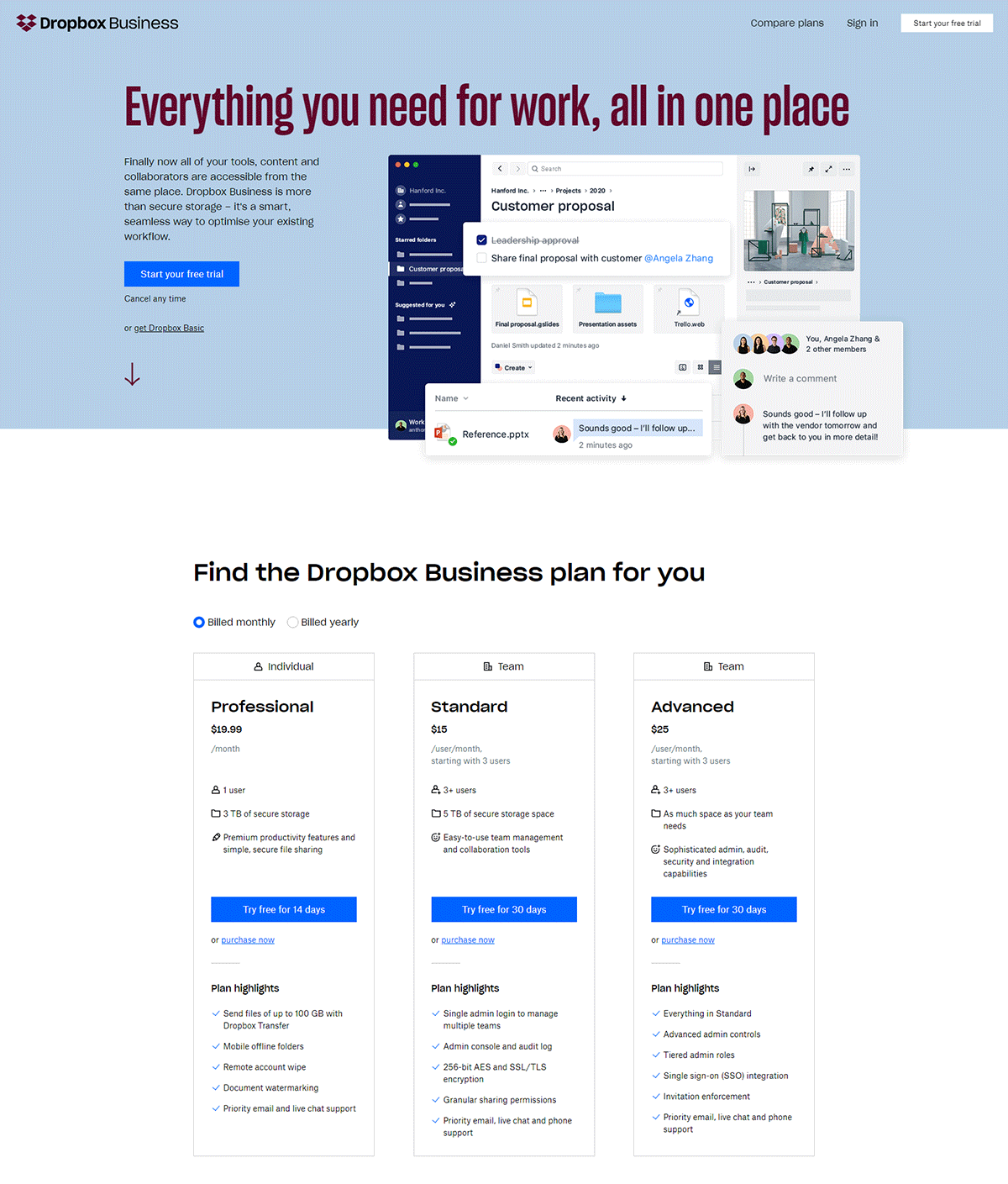
Landing pages are built for offering a quality experience to the visitors and driving conversion. The conversions must give a targeted message by matching up with the requirements of the users. There are certain questions you should think of before building a landing page. Let’s take a peek at some of the important questions you must ask yourself before designing a landing page.
1
What is Your Goal?
After arriving on your landing page, what do you want your visitors to do? Do you want them to fill a form, buy your product, sign up for your newsletter, download an ebook or something else? In order to develop a strategy, you need to have a defined goal. If you want to track conversions, define conversions first.
2
Who is Your Audience?
Before implementing any step, or technique, you should know the audience you are working for. Learn more about their expectations and dreams. Get a better understanding of how you can cater to those requirements. Try to think like your audience.
3
Who Are Your Competitors?
Keep an eye on your competitors. Try to implement the latest marketing strategies and design strategies in your industry and make your brand stand out.
Why Do You Need a Landing Page?
A landing page brings traffic to your website, improvises your search engine marketing, and sets up your brand. Landing pages lead the customer towards a particular goal – to buy your product or service. A landing page encourages them to take the action you set for them. It is the right medium for conversion and constructing a good customer base.
1. A Support System
If you have a landing page, you are supporting your business goals – promotion of products, pitching to new customers, and earning more revenue. You can cater the content of your pages to a particular audience as well.
2. Generation of Insightful Data
After your landing page is linked to a particular campaign, source, or action, you can simply observe channels that are bringing in the traffic and leads. The information about your visitors’ interests and online activities will help you keep track of their behavior.
3. Improvised Search Campaigns
The success of search engine marketing (SEM) or paid search campaigns is dependent upon the click-through rates, and those are influenced by landing pages. Using an SEM campaign for bidding on keywords helps with the visibility of your business on the search engines. But if your ads direct to a landing page, users see more information about your product or service, and hence more leads can be generated.
How Do Landing Pages Work?
1
A user is directed to a landing page form after clicking on a call-to-action (CTA) link or button.
2
The user fills out the form if interested - turning from a user into a lead.
3
The information filled by the lead is saved in the database.
4
The lead is marketed based on the information they submitted.
With marketing automation tools like HubSpot, you can learn when the leads were converted, and their different interactions with your landing page. With this information you can permit the lead to move in a specific direction – a fostered lead moves through the marketing funnel quickly.
What Makes a Great Landing Page?
An Eye-catching Design
The average attention span of an internet user stands at a paltry 8 seconds. The field of view should have space for a clean, subtle, and absorbent landing page design. The design of the landing page should showcase the color of the brand and give a beautiful view. Concentrate on a single call-to-action and limit your form to 3 – 4 fields.
Unique Images
You require an enthralling offer to secure conversions. A good set of images on a landing page can impress the users. Use eye-catching images to grab the user’s attention. Avoid using stock imagery and keep the images aligned to your brand e.g. use your brand colors in your images.
Not So Basic Copy
A short and precise copy compliments a landing page. A short copy always works – if you can’t write yourself, hire a content writer online. Use visuals for the introduction of your pitch and break up the long periods of paragraphs. A short copy combined with a clear call-to-action form an effective landing page.
Top 4 Tips to Improve Landing Page Design and Performance
Great Landing Page Examples
Uber
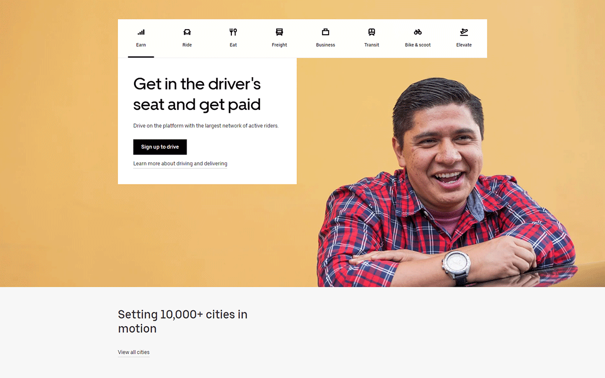
Uber has a very clear and precise headline – the intended benefit makes it sign up worthy. The picture they have used here oozes confidence and happiness.
Shopify
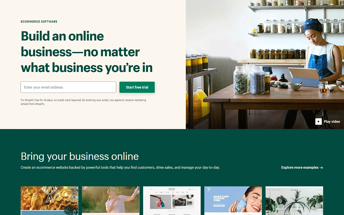
The information provided on Shopify’s homepage is easily digestible from the small and medium businesses’ point of view – the audience this website is targeting. The provided form asks for only one essential – your email.
Slack
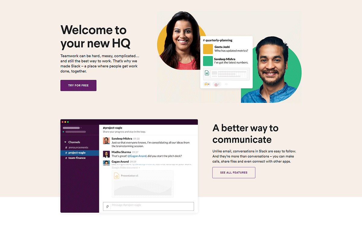
Slack understands that communication is the key between teams of any size and it makes sure those conversations are as easy to follow as possible. The pastel colors look great and lift your spirit.
HubSpot
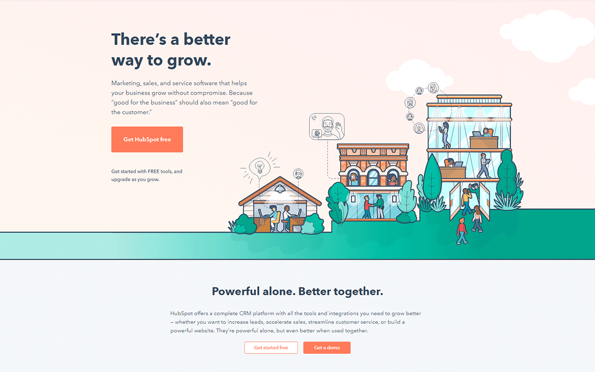
HubSpot sells marketing and sales software and knows how to help grow your business better. It’s great at evoking emotion by making the messaging and illustrations about its users and their customers.
Zoom
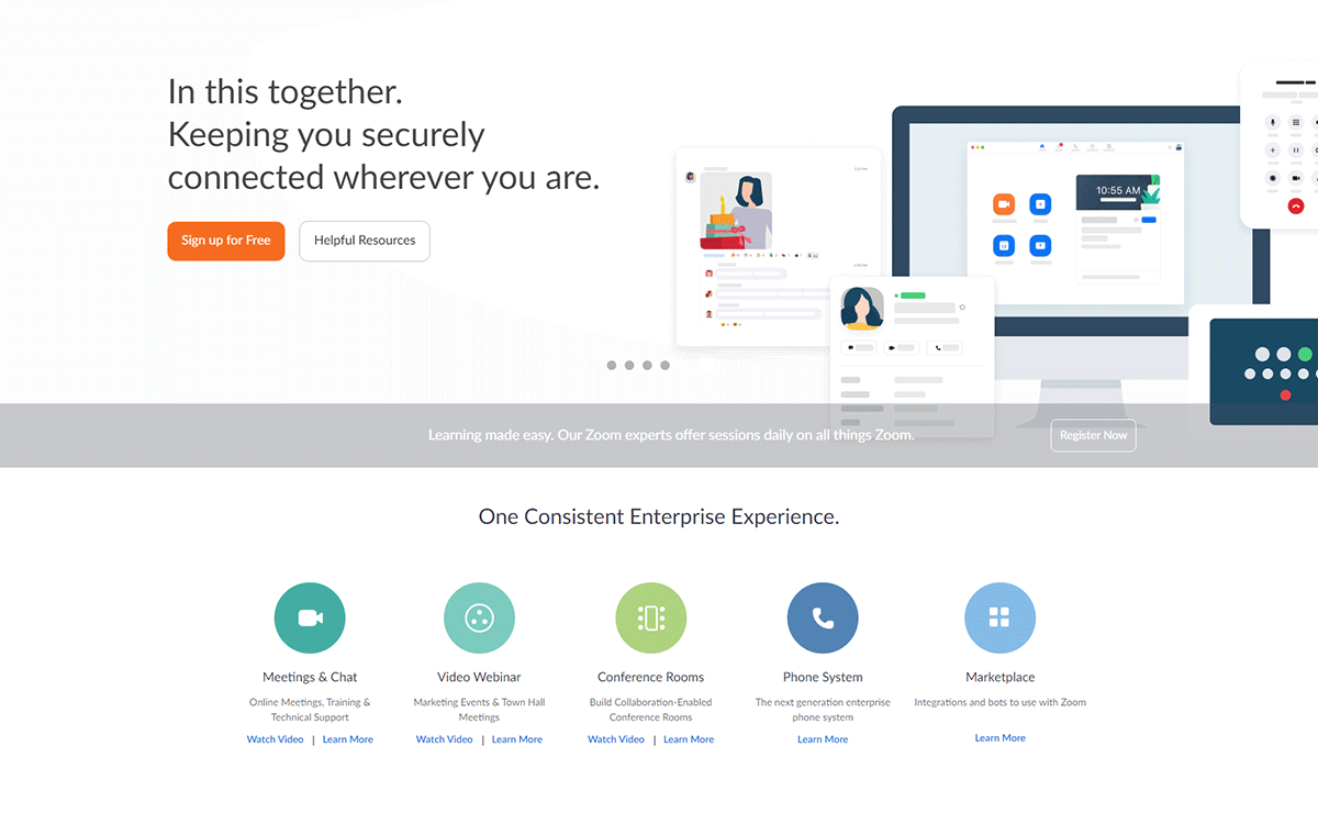
The design looks very professional and the main call-to-action button is well contrasted. Zoom has also highlighted the consistent experience its tool offers for enterprises. It’s also encouraging users to check out the helpful resources.
Should You Test Your Landing Pages?
Even though you have designed your landing page, the process doesn’t end here. Testing is mandatory for being up to date with the trends and your visitors. Customer feedback can help with small adjustments and raise conversions.
Track Analytics
Tools like Google Analytics are great for creating event trackers to check the number of CTA clicks, time people spend on your page, and a lot more.
Conduct User Testing
User Testing is helpful in attaining essential data about what is working and what is not. It involves understanding how people do a particular task on the page as of today and how they will use an alternative website to do that same job. User testing can also be done with different tools like Convert or UserTesting.
Run A/B Tests
A/B testing helps in testing different elements like page length, colors, headings and content, etc. for different sets of audiences. It also helps in determining which version is getting the most conversions.
Conclusion
A landing page is a place where you want your customers to click and buy your product or services. It essentially becomes a key to a successful marketing strategy, but the rules are not set in stone. It’s important to not miss the testing phase as you can always test different designs and call-to-action buttons to see what best works for you.